Category Archives: Design
Various onFocus animations using Fluent Forms
*Note – I’ve noticed the dark theme on this website can make the onFocus effects harder to see. If that is the case, try viewing this blog post with the “light” theme.
Fluent Forms onFocus Examples
To be used with Text or TextArea type inputs in Fluent Form. Every example needsto add the class “animated_form_element” under the Advanced Options for each of the text/textarea’ “Element Class” field such as below:

For each set of animations, hit the reveal button to show the code that has to be added to your Fluent Form’s Custom CSS/JS sections. That section can be found under “Settings & Integrations tab -> Custom CSS/JS”
Underline
Drop In Underline Example:
Left To Right
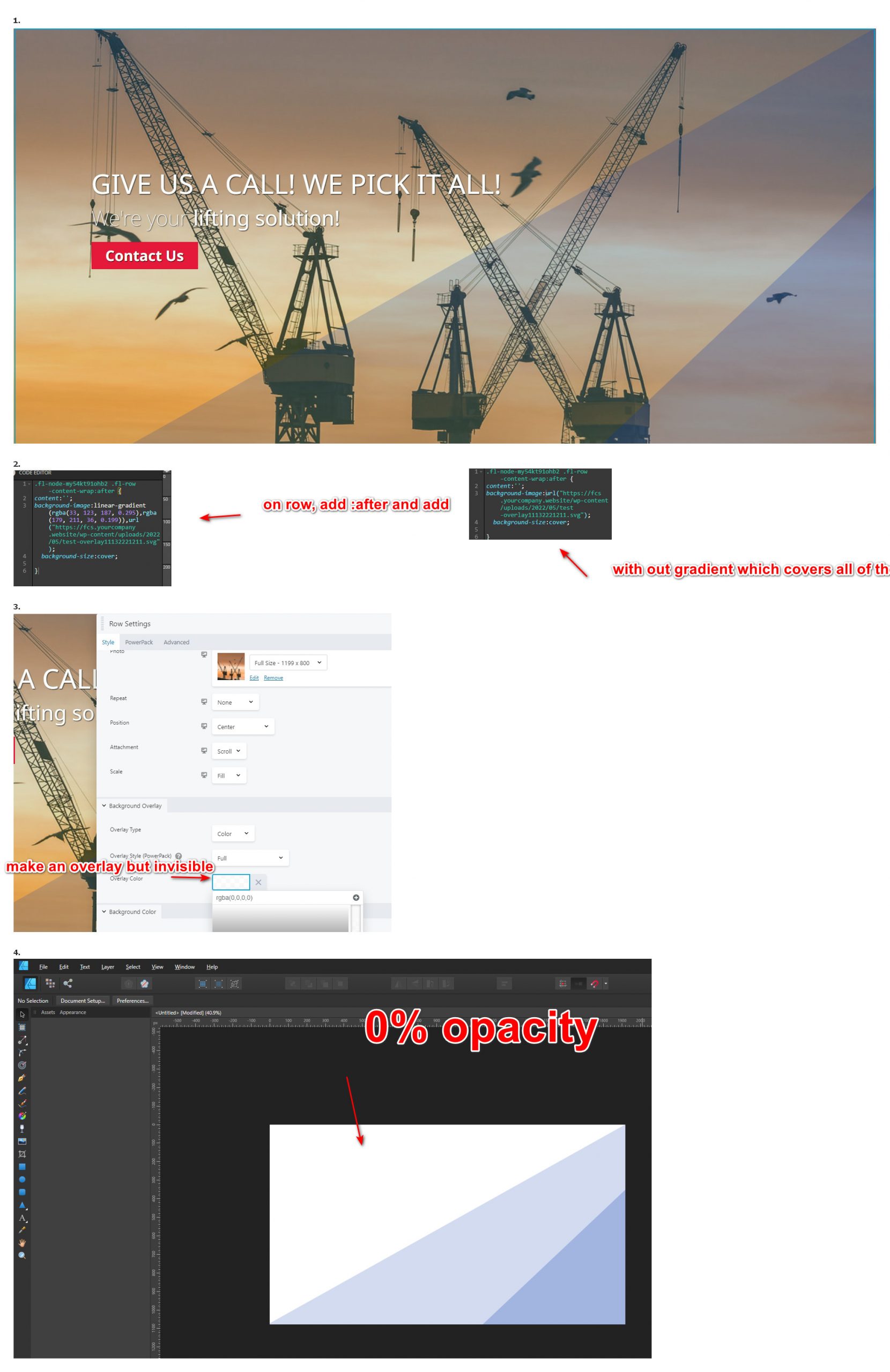
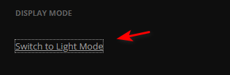
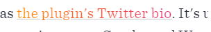
Background overlay on mobile for Oxygen builder
In Oxygen, you can apply a background image as well as an image overlay within the options. However, these settings can not be changed per break point. Why would you want it to change based on break point? If the foreground text is hard to read due to not enough contrast when in the mobile view(or any really) then you would want to increase the rgba transparency value. Here is what I do in oxygen to do this since the overlay can’t be changed per breakpoint.
First, I give the hero section a base class of .hero , in that class I only specify settings that will apply to all other hero sections layouts that are the same minus the variable background image be used. Then, I add an additional class that is only used and is specific to that page to dictate the background image and to handle the image overlay in media queries in css.
i.e.
|
1 2 3 4 5 6 7 8 9 10 11 12 13 14 15 16 17 18 19 20 21 22 23 24 25 26 27 28 29 |
/* overlay for everypage. hero is homepage with it's unique layout settings, hero2 is sub pages that share the same hero layout . The class for the page specifies the background image and handles overlay on mobile */ @media(max-width:991px){ #hero{ background-image:linear-gradient(rgba(0,0,0,.5),rgba(0,0,0,.5)),url(https://idealwebdesign.net/sites/vanilla/wp-content/uploads/2020/07/background.jpg); } #hero2.v1-page{ background-image:linear-gradient(rgba(0,0,0,.5),rgba(0,0,0,.5)),url(https://idealwebdesign.net/sites/vanilla/wp-content/uploads/2020/07/v1.jpg); } #hero2.v6-page{ background-image:linear-gradient(rgba(0,0,0,.5),rgba(0,0,0,.5)),url(https://idealwebdesign.net/sites/vanilla/wp-content/uploads/2020/07/V6-DBL.jpg); } #hero2.v5-page{ background-image:linear-gradient(rgba(0,0,0,.5),rgba(0,0,0,.5)),url(https://idealwebdesign.net/sites/vanilla/wp-content/uploads/2020/07/V5-DBL.jpg); } #hero2.v4-page{ background-image:linear-gradient(rgba(0,0,0,.5),rgba(0,0,0,.5)),url(https://idealwebdesign.net/sites/vanilla/wp-content/uploads/2020/07/V4-DBL.jpg); } #hero2.v3-page{ background-image:linear-gradient(rgba(0,0,0,.5),rgba(0,0,0,.5)),url(https://idealwebdesign.net/sites/vanilla/wp-content/uploads/2020/07/V3-DBL.jpg); } #hero2.v2-page{ background-image:linear-gradient(rgba(0,0,0,.5),rgba(0,0,0,.5)),url(https://idealwebdesign.net/sites/vanilla/wp-content/uploads/2020/07/V2-DBL.jpg); } } |
So here we have 2 different types of hero layouts. #hero and #hero2 – neither of these contain the background or overlay settings. The classes like .v2-page is only used for that page and contains the background image specific for that page. The overlay for mobile is also handled.
Misc cool CSS tricks
To create text that has a gradient of colors i.e. hover text for links (see below as an example)
This can be create with the below code:
|
1 2 3 4 5 6 7 8 9 |
a.hover-effect{ background: -webkit-gradient(linear,left top,right top,from(#ff8a00),to(#e52e71)); background: linear-gradient(90deg,#ff8a00,#e52e71); -webkit-background-clip: text; -webkit-text-fill-color: transparent; /* this is needed */ -webkit-box-decoration-break: clone; box-decoration-break: clone; text-shadow: none; } |
CSS3 Notes
CSS3 Animation
animation: flip 1s linear 2s 1 normal ;
Properties
name – Name of the animation used when creating the keyframes
duration – How long the animation lasts
timing-function – Determines the actual speed of the animation (i.e. linear / ease / ease-in / ease-out )
delay – how long before the animation is actually performed.
iteration-count – how many times the animation will happen.
direction – Wether the animation performs keyframes 0 to 100 or 100 to 0.
fill-mode – defines what style will be applied before or after the animation is done.
Transform
translate value works a bit like that of relative positioning, pushing and pulling an element in different directions without interrupting the normal flow of the document. Positive values will push an element down and to the right of its default position while negative values will pull an element up and to the left of its default position.